Worked on both UI and UX for the Younility mobile app for both Android and iOS.
Created used Sketch while using InVision for Prototyping.
This project was a challenge in a few different ways.
First, this was my first time designing for mobile, before this I designed mostly for web. I learned a lot and became familiar with mobile design.
Second was figuring out how to design features for the app that would both work on the smaller screen and would work in both iOS and Android (Material) designs. I learned that there were some UI designs that would work on Android but not iOS, so adjustments had to be made. But I tried to keep both designs as similar as possible.
While working on this I became familiar with both the iOS Human Interface Guidelines and Material Design.
Some screenshots of the mobile app can be seen below. iOS version is on the left and the Android version on the right.


List of all tasks assigned to the user.
Overall the design is similar yet follows the design for the platform it was created for.
One of the challenges here was trying to fit information in the task tile without it feeling overwhelming or crowded yet the user can get what they need from just a glance.

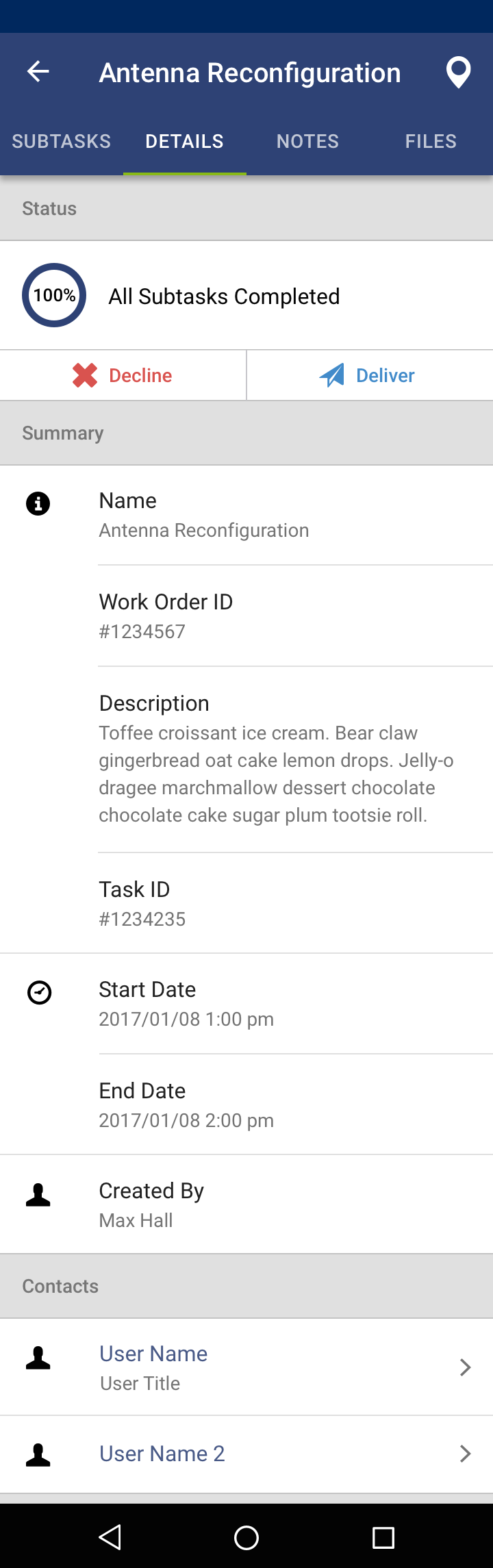
Once a task is opened a task details screen is shown.
Here you can see some differences between the two platforms.
One is the tabs. Where it is often used in Material Design for Android, tabs are not part of iOS design. But iOS does however have a segmented control, which can be used for the same function.

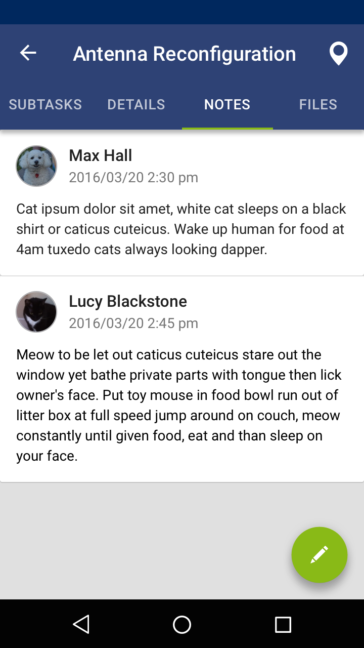
One of the things that can be added to a task is a note.
Again here we see another difference that was made between platforms.
Material Design makes use of a floating action button which is displayed on the bottom right of the screen. Pressing this will give the user an option to add a note. This is not something typically used in iOS. So a button was created that displays at the top of the screen which would do the same function.


If a task or subtask has an address the user has the ability to view them on a map. When pressing an icon they can view more information or get driving directions (which opens in a separate map application).
One challenge here was clusters. If there are two or more tasks in one location we needed away to view each one separately. In this case the box at the bottom will have an indication that it is swipable, allowing the user to view each task/subtask.

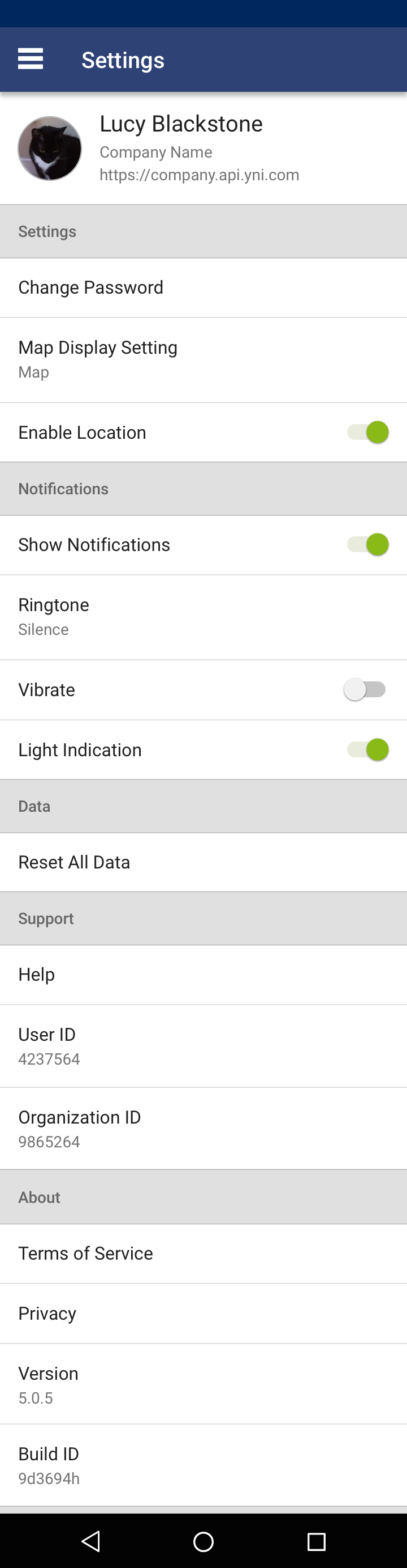
Examples of the settings/account screens and the different information that can be seen here.
Some of the differences is due to how each one navigates. Android uses a hamburger menu where the iOS uses tabs at the bottom of the screen. So for Android the "Sync" and "Log Out" can be accessed in the hamburger menu where as in iOS it needs to be placed in the Account screen.


Tasks also have the ability to have steps. This is probably one of the biggest features of the app.
Steps are basically forms where the user can either enter or view information.
Once a step is submitted it will show an overlay with what was entered or what information the step had. This was editable.
